Back to top
Back to top
Abercrombie & Fitch Redesign Project
Revamping Design for a More Accessible and User-Friendly Experience
Revamping Design for a More Accessible and User-Friendly Experience
Revamping Design for a More Accessible and User-Friendly Experience
In this project, I’ll walk you through my redesign of several key components of the Abercrombie and Fitch retail website. The case study highlights four primary pain points I identified while interacting with the site. I’ll outline my redesign process for each pain point, integrating Jakob Nielsen’s 10 Usability Heuristics to ensure a user-centered approach.
The process I followed includes:
Identifying and analyzing the pain points.
Focusing on improvements for better user accessibility and experience.
Developing low and high-fidelity wireframes for various devices.
Throughout the project, I’ll reflect on the insights and lessons learned from addressing these challenges, including how to improve user experience while considering the broader business context. This project aims to showcase how design adjustments can significantly enhance usability without losing sight of the brand's identity.
Project Role
Project Role
Project Role
Independent Project - Solo
Independent Project - Solo
Independent Project - Solo
Methods/Tools Used
Figma, Wireframing, Prototyping, User Flow Charts
Figma, Wireframing, Prototyping, User Flow Charts
Figma, Wireframing, Prototyping, User Flow Charts
Duration
October 2024
Appx. 3 weeks
October 2024
Appx. 3 weeks
October 2024
Appx. 3 weeks
Identifying The Problem
Identifying The Problem
I began my journey on Abercrombie & Fitch's website by navigating it as a typical user, searching for and purchasing a product. Throughout the process, I encountered several pain points that hindered the overall user experience. The key issues I identified were:
Redundancy of Call-to-Action Buttons: Multiple, unnecessary call-to-action buttons on the homepage and navigation caused confusion.
Inaccessible Filter Section: The filter options were not easy to use or navigate, making it harder to find desired products.
Sold-Out Items Displayed as Available: Items marked as sold out were still shown as available, leading to user frustration.
Email Required Before Checkout: Users were prompted to provide an email before completing a purchase, creating an unnecessary obstacle.
These pain points highlighted areas where improvements could be made to enhance the overall user experience.
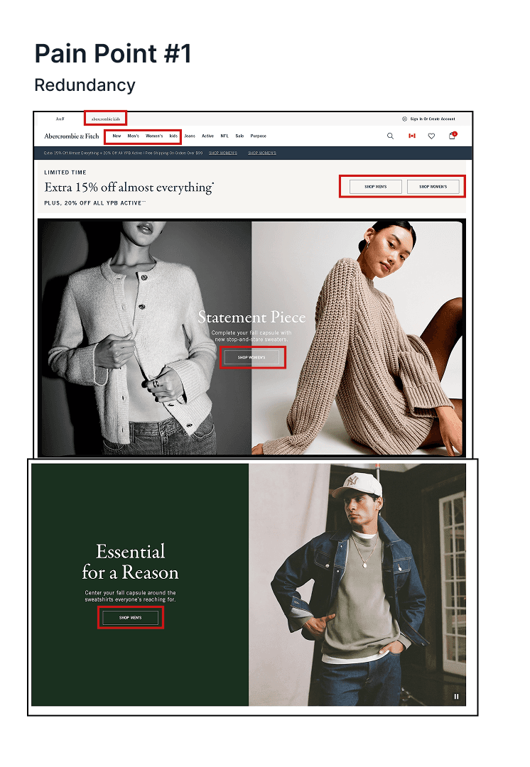


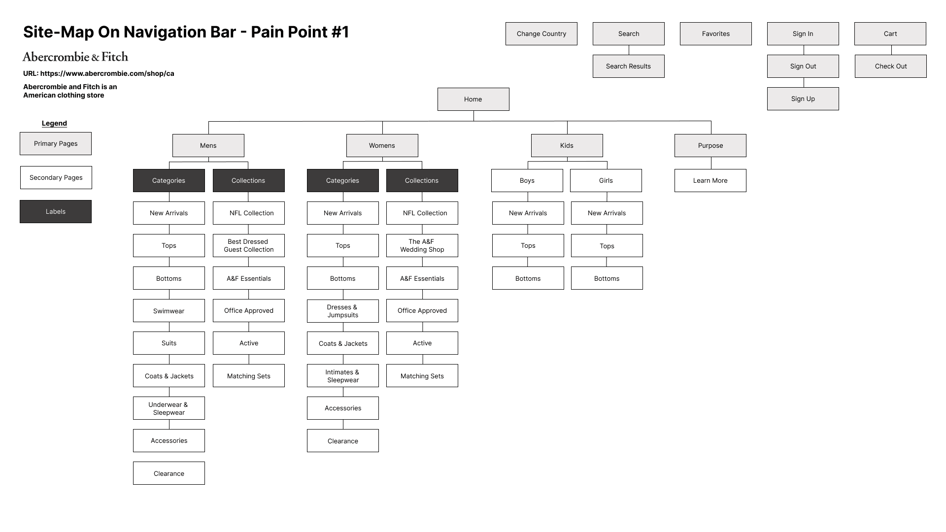
Pain Point #1
Problem: Redundancy of Call-to-Action Buttons
The excessive number of identical call-to-action (CTA) buttons on the homepage creates redundancy, which increases cognitive load and makes it harder for users to prioritize actions. This confusion can lead to a lack of clarity about what the user should do next, and the pressure to click on multiple buttons can disrupt the flow of the page. The overload of buttons also violates the principle of minimalist design, cluttering the page with unnecessary elements. This can cause users to feel frustrated and overwhelmed, making the interface less intuitive and harder to use.

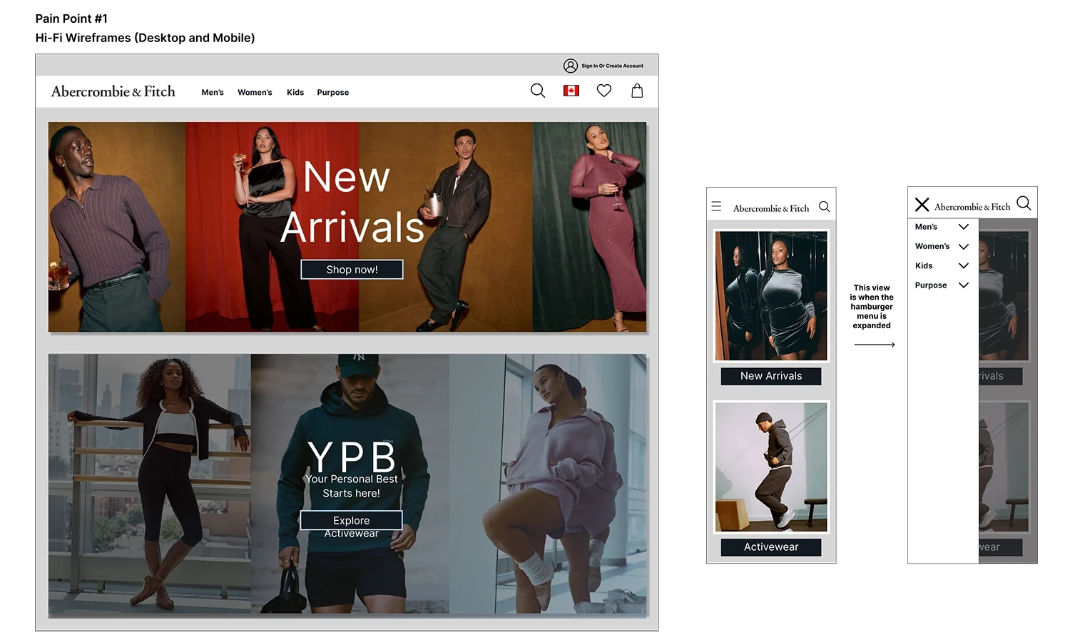
Solution: Recreating the navigation bar and home page
To reduce redundancy, the navigation bar should be simplified, focusing on essential options to avoid overwhelming users. Main categories can be integrated into the homepage’s primary images, guiding users to popular sections in a clear, visual way. This will reduce cognitive load, streamline navigation, and create a more intuitive user experience.
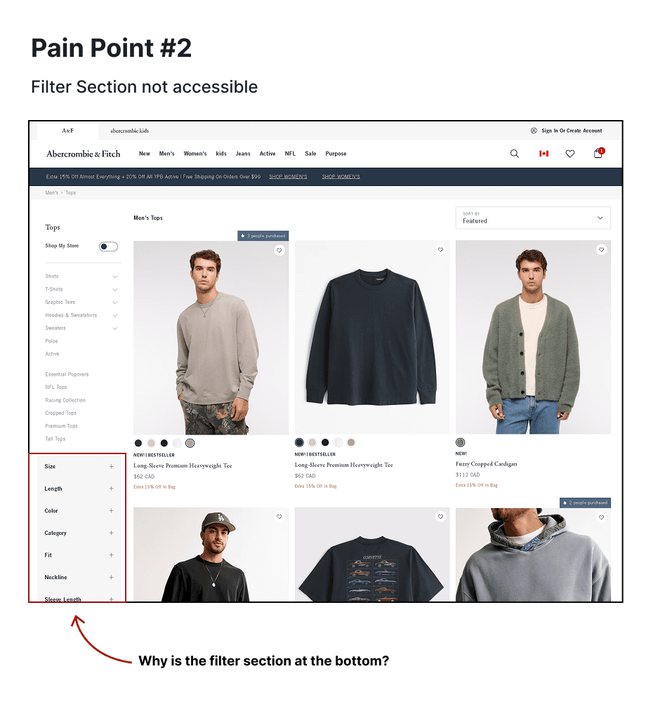
Pain Point #2
Problem: Filter section is not accessible
In the men’s and women’s clothing sections, the filter options are placed in the top-left corner of the page, making them hard to locate and access. This hidden placement creates a significant accessibility issue, as users may struggle to find the filters when attempting to narrow down their search.
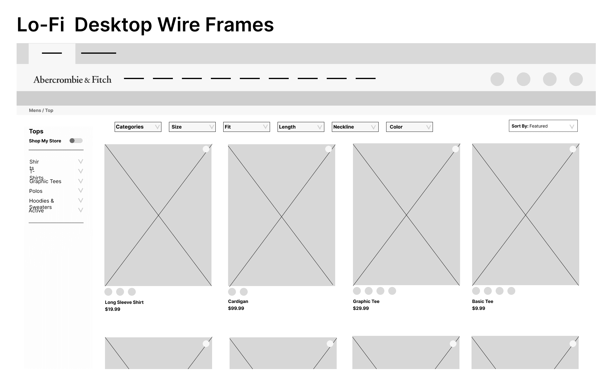
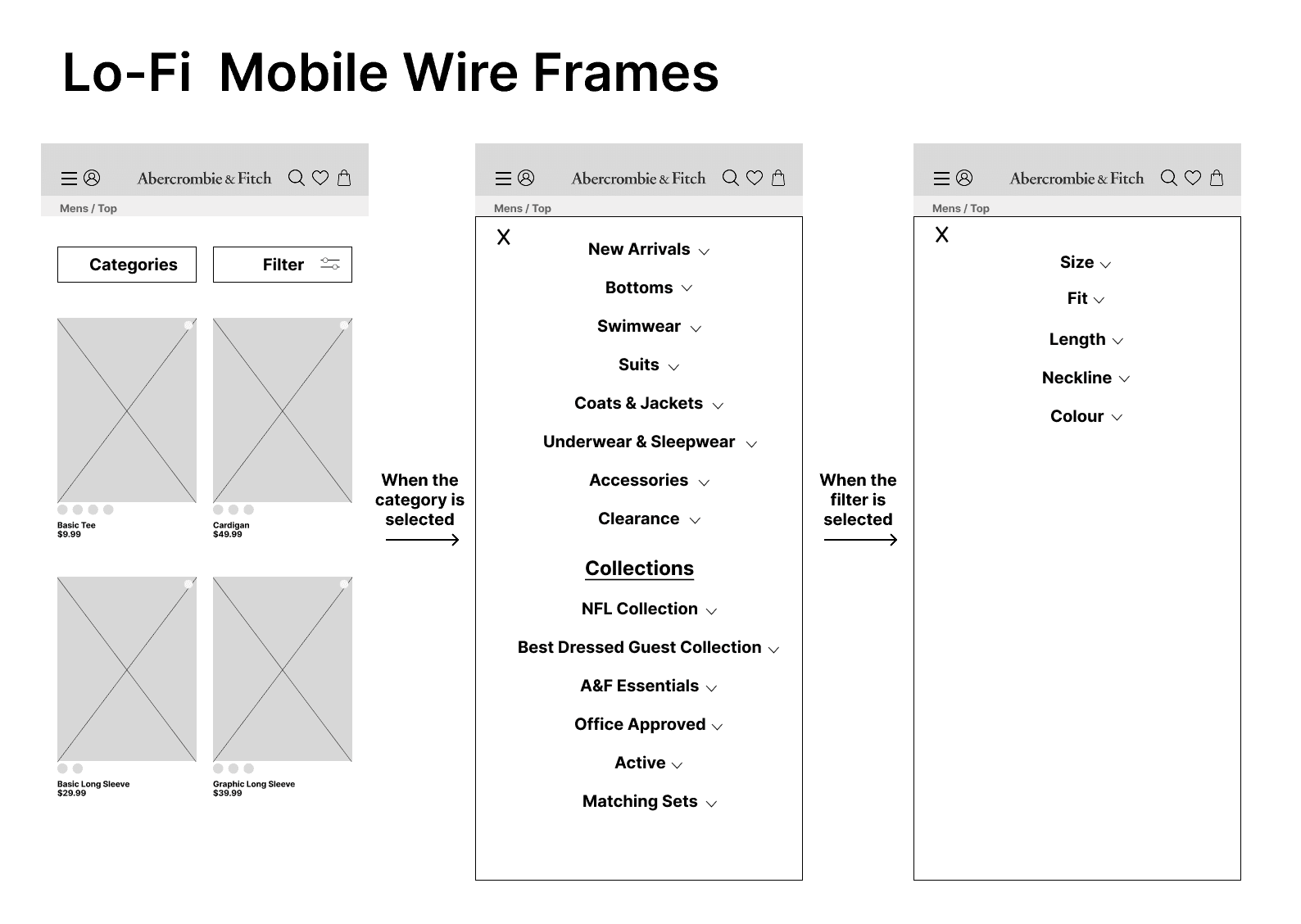
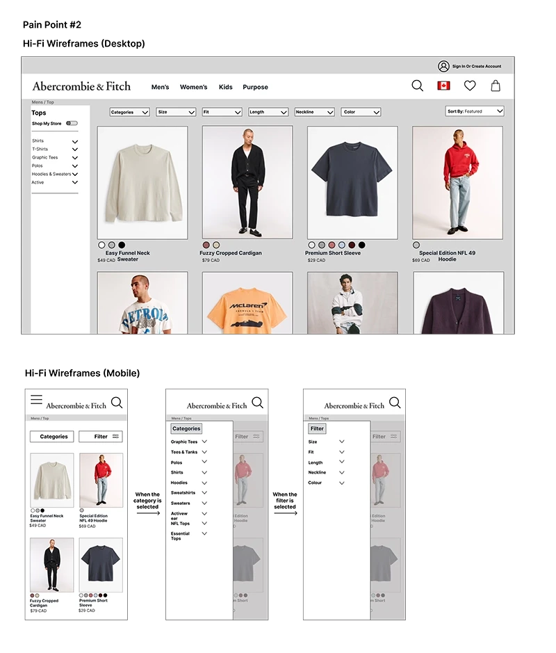
Solution: Re-locating the filter section
Relocating the filter section to a more prominent and accessible position on the page will improve user experience by making it easier for users to find and interact with the filtering options. By placing the filter in a more intuitive location, users will have a clearer, more straightforward path to narrow down their search and find specific items more efficiently.
Pain Point #3
Problem: Sold out item being shown as available
While browsing the website, I encountered an issue where an item initially appeared to be available for purchase. However, once I proceeded to checkout, the item showed as sold out. When attempting to edit the size to see if other sizes were available, the page became stuck on a loading screen. Returning to the product page still showed the item as available for checkout, but attempting to proceed led to a dead end, with no error message or indication of the issue. There was no 404 error page or helpful message to inform the user that the item was no longer available, which resulted in a frustrating and unclear experience.

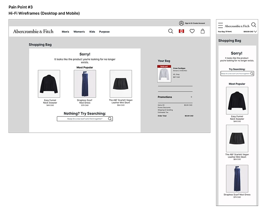
Solution: Creating a 404 page for the sold out item
I created a 404 error page to inform users when an item is no longer available, rather than leading them to a dead end. This page provides clear feedback about the issue and helps guide users back to relevant sections of the site. It offers options to explore similar items, navigate to the homepage, or return to the product category, reducing frustration and allowing users to continue their shopping experience without disruption.
Pain Point #4
Problem: Need to add an email to check out
Currently, users are required to enter an email address before they can proceed to checkout. If the email field is not completed, users are unable to continue with their purchase, creating a dead end in the checkout process. This forces users to provide their email without offering any alternative options or flexibility, potentially frustrating them and causing unnecessary friction in the user journey.

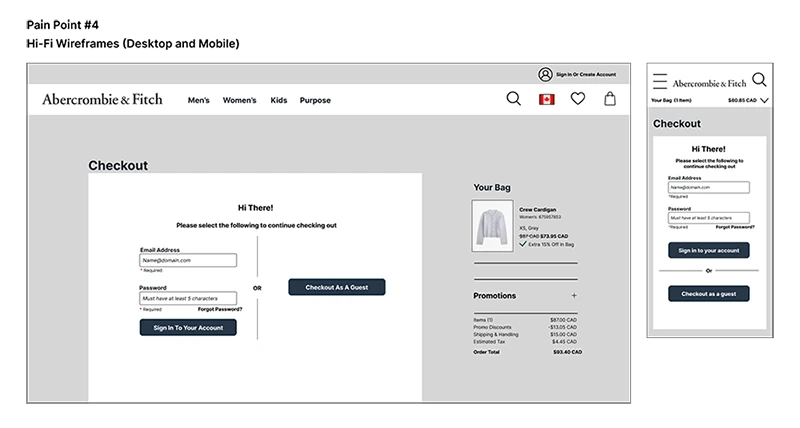
Solution: Adding an option to check out
To improve the checkout process, I recommend adding an option to checkout as a guest. This gives users the freedom to choose whether they want to sign in, create an account, or proceed without any registration. Allowing guest checkout removes unnecessary barriers, ensures a smoother experience, and prevents dead ends, enabling users to complete their purchase without being forced into signing up or providing an email upfront
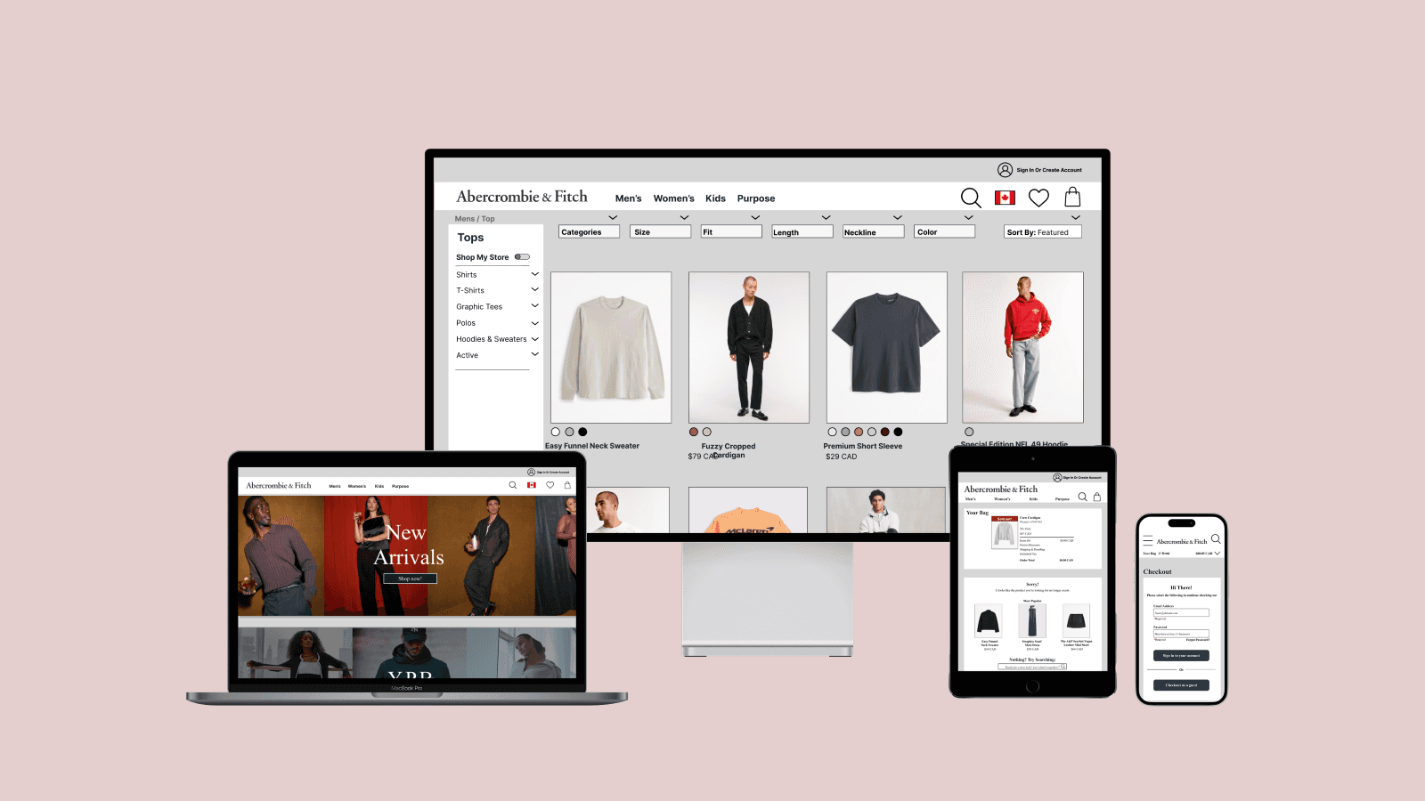
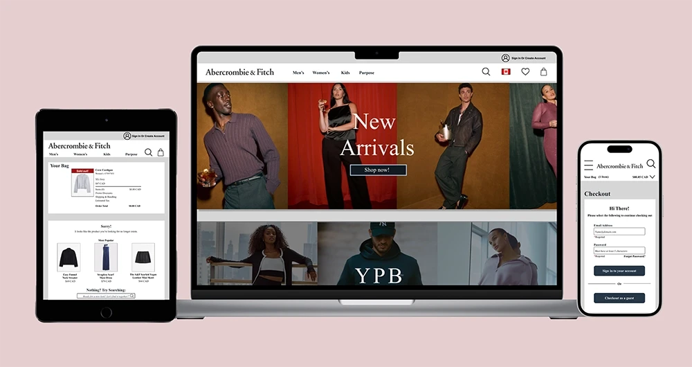
The image above shows the final results to what it would look like in different device views with the newly redesigned for each pain point listed above.
The image above shows the final results to what it would look like in different device views with the newly redesigned for each pain point listed above.
Learnings Along The Way
Learnings Along The Way
Through this assignment, I gained a deeper understanding of the importance of user accessibility and how the 10 usability heuristics shape effective user interface design. From the initial stages of identifying pain points to mapping user flows and progressing from lo-fidelity wire frames to high-fidelity design mocks, I was able to see how each phase impacts the overall user experience. Additionally, I learned how to leverage tools like contrast checkers and accessibility plugins to ensure the design was inclusive and met accessibility standards. This process emphasized the value of creating designs that are both functional and accessible to a wider range of users.
Through this assignment, I gained a deeper understanding of the importance of user accessibility and how the 10 usability heuristics shape effective user interface design. From the initial stages of identifying pain points to mapping user flows and progressing from lo-fidelity wire frames to high-fidelity design mocks, I was able to see how each phase impacts the overall user experience. Additionally, I learned how to leverage tools like contrast checkers and accessibility plugins to ensure the design was inclusive and met accessibility standards. This process emphasized the value of creating designs that are both functional and accessible to a wider range of users.
Through this assignment, I gained a deeper understanding of the importance of user accessibility and how the 10 usability heuristics shape effective user interface design. From the initial stages of identifying pain points to mapping user flows and progressing from lo-fidelity wire frames to high-fidelity design mocks, I was able to see how each phase impacts the overall user experience. Additionally, I learned how to leverage tools like contrast checkers and accessibility plugins to ensure the design was inclusive and met accessibility standards. This process emphasized the value of creating designs that are both functional and accessible to a wider range of users.
Next Steps & Improvements
Next Steps & Improvements